Oregon State Leather Contest
Role: Art direction, designer
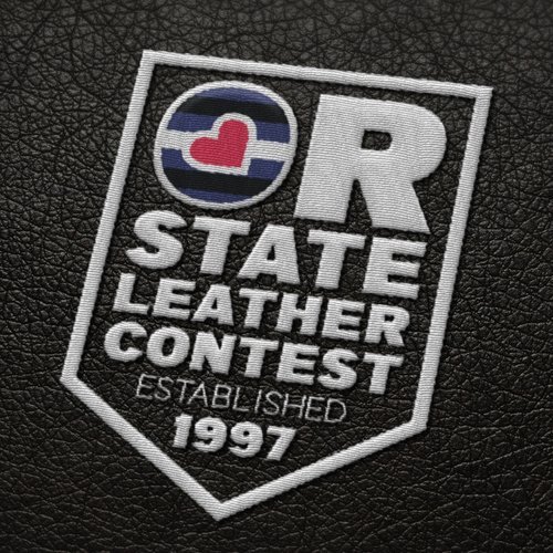
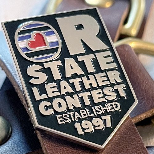
A twenty year plus institution, The Oregon State Leather Contest hadn’t had a logo update since its inception. With a new generation joining the scene, it was time for a new look. Goals included integrating the community flag’s colors and elements, and creating merchandise that would stand out in national level contests.
Logo and Branding
I chose to portray the flag’s colors within the O of Oregon, allowing the heart to stand in for the o’s counter. Knowing that these would be worn on the shoulders and upper arms of community members, the shield shape was used to give this logo the look of a rank or insignia.
Lastly, I provided an alternative horizontal logo that could be used on the banner for Pride parades.
Brand guidelines
Times may change but brand guidelines make sure that the identity remains timeless. Here’s a few pages from the complete guide.
Merchandise - Patches, embroidery, and metal pins
What’s a contest without swag? These pins were given to runner up contestants while the embroidery was featured on winning contestant’s leather vests and shirts.


